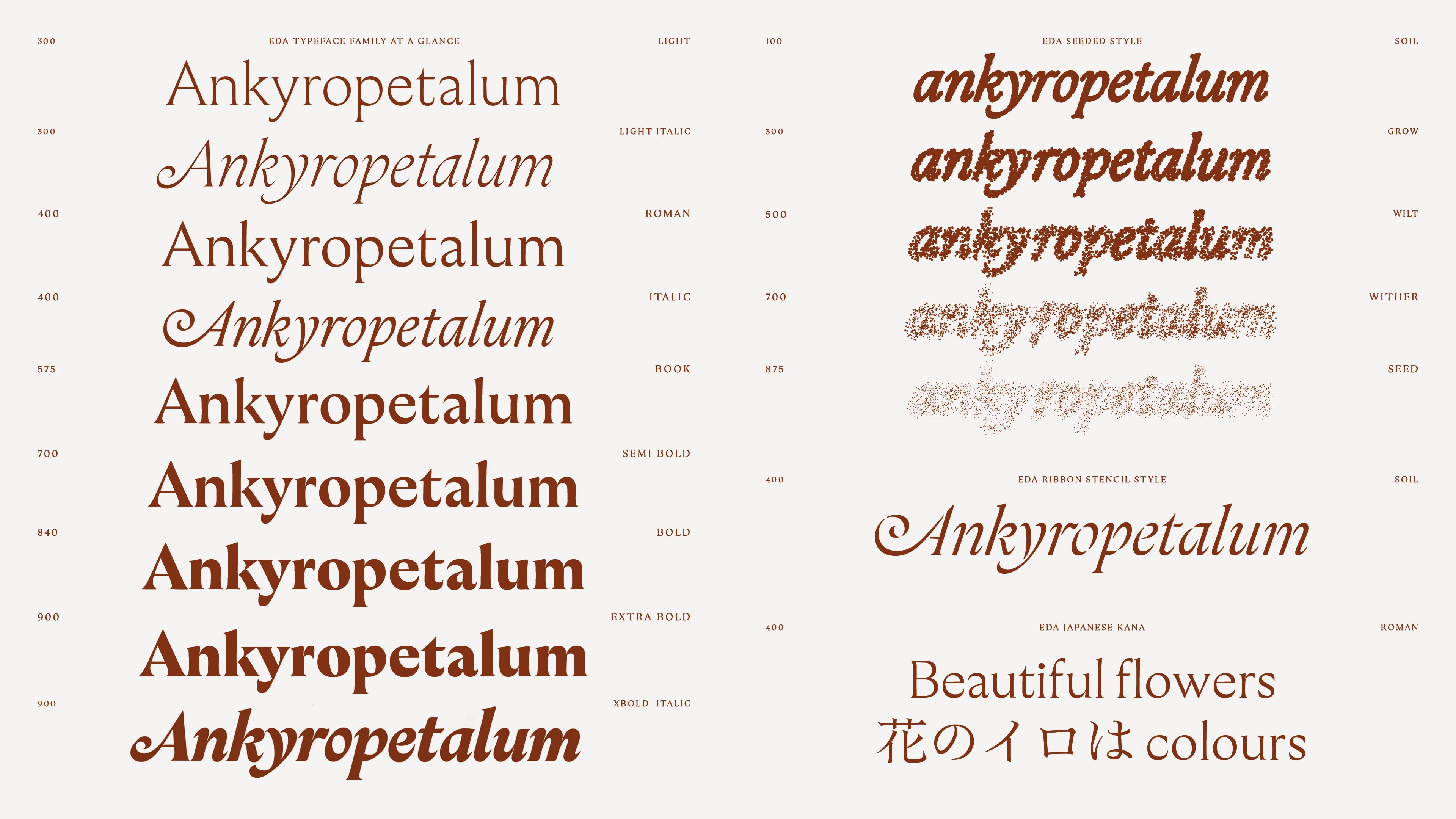
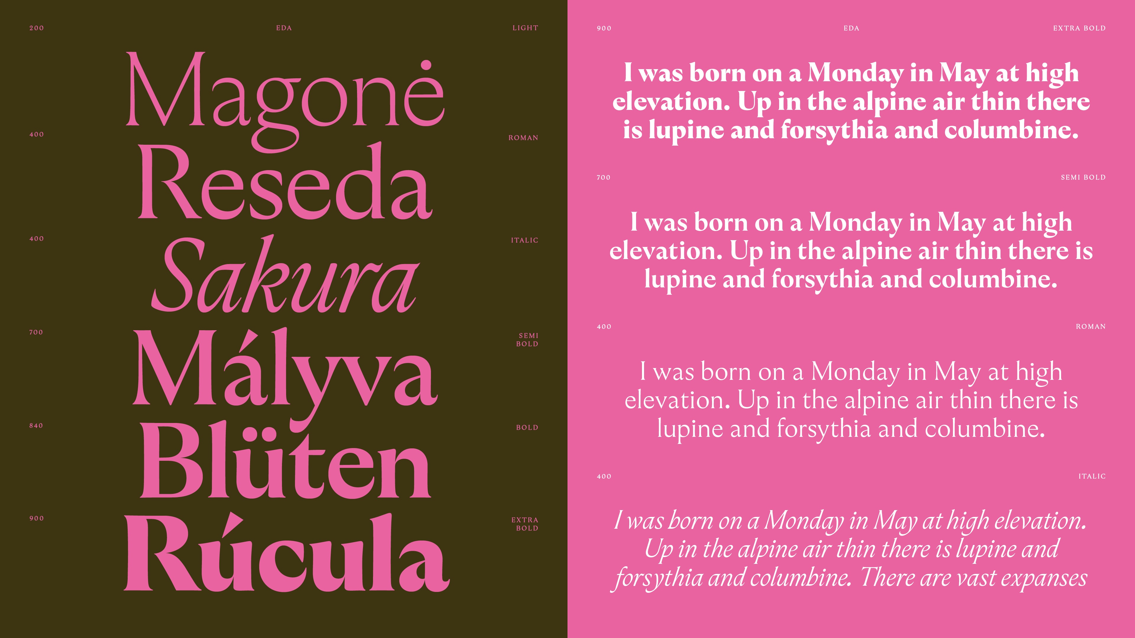
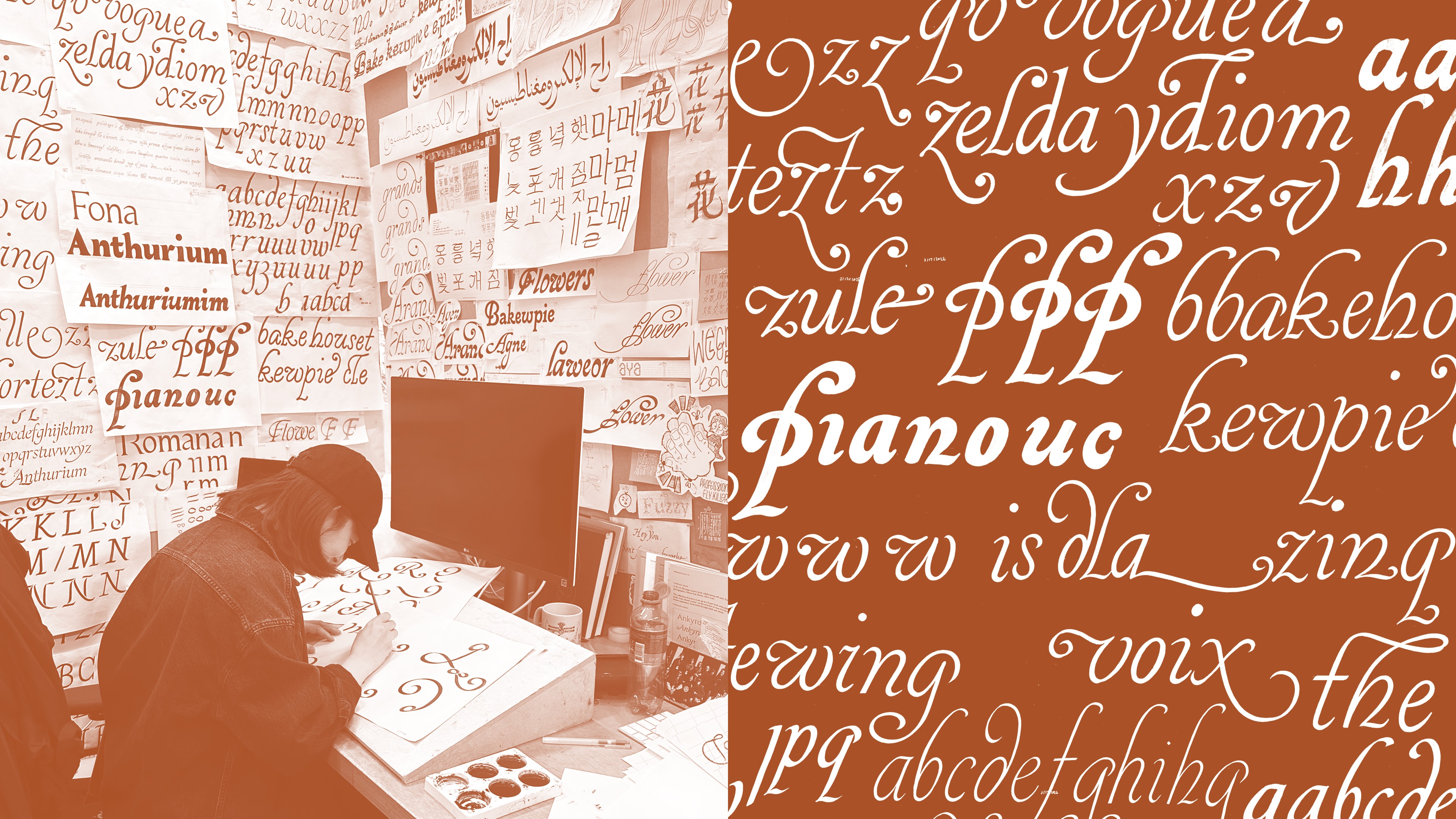
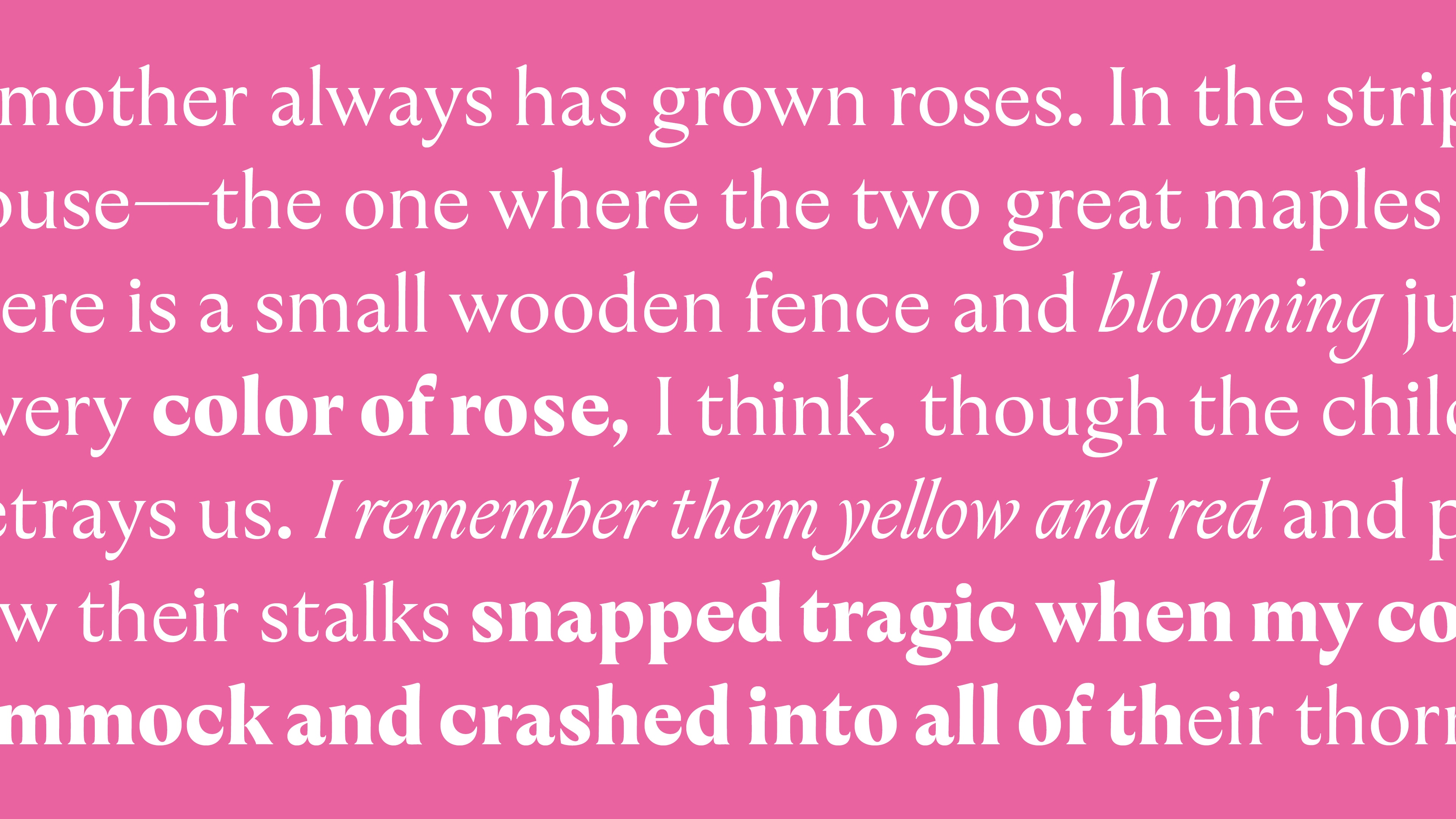
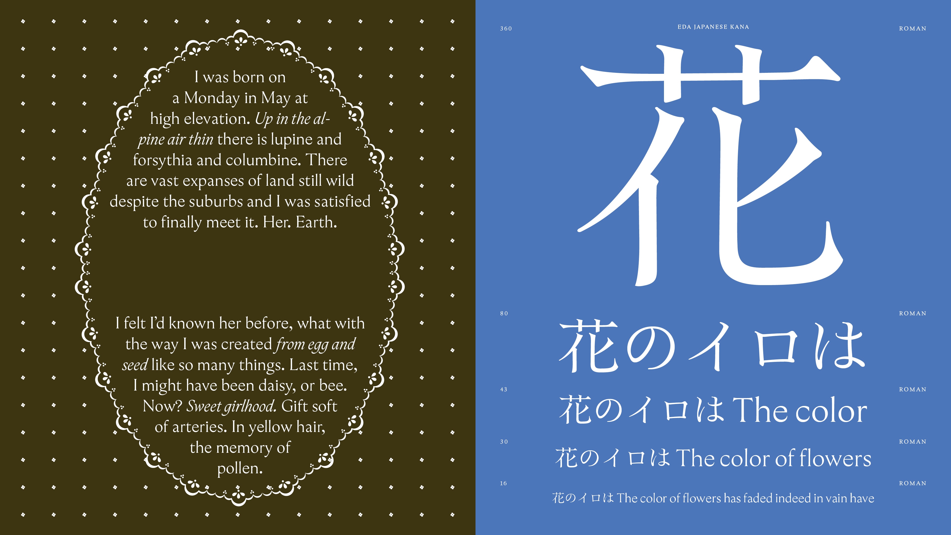
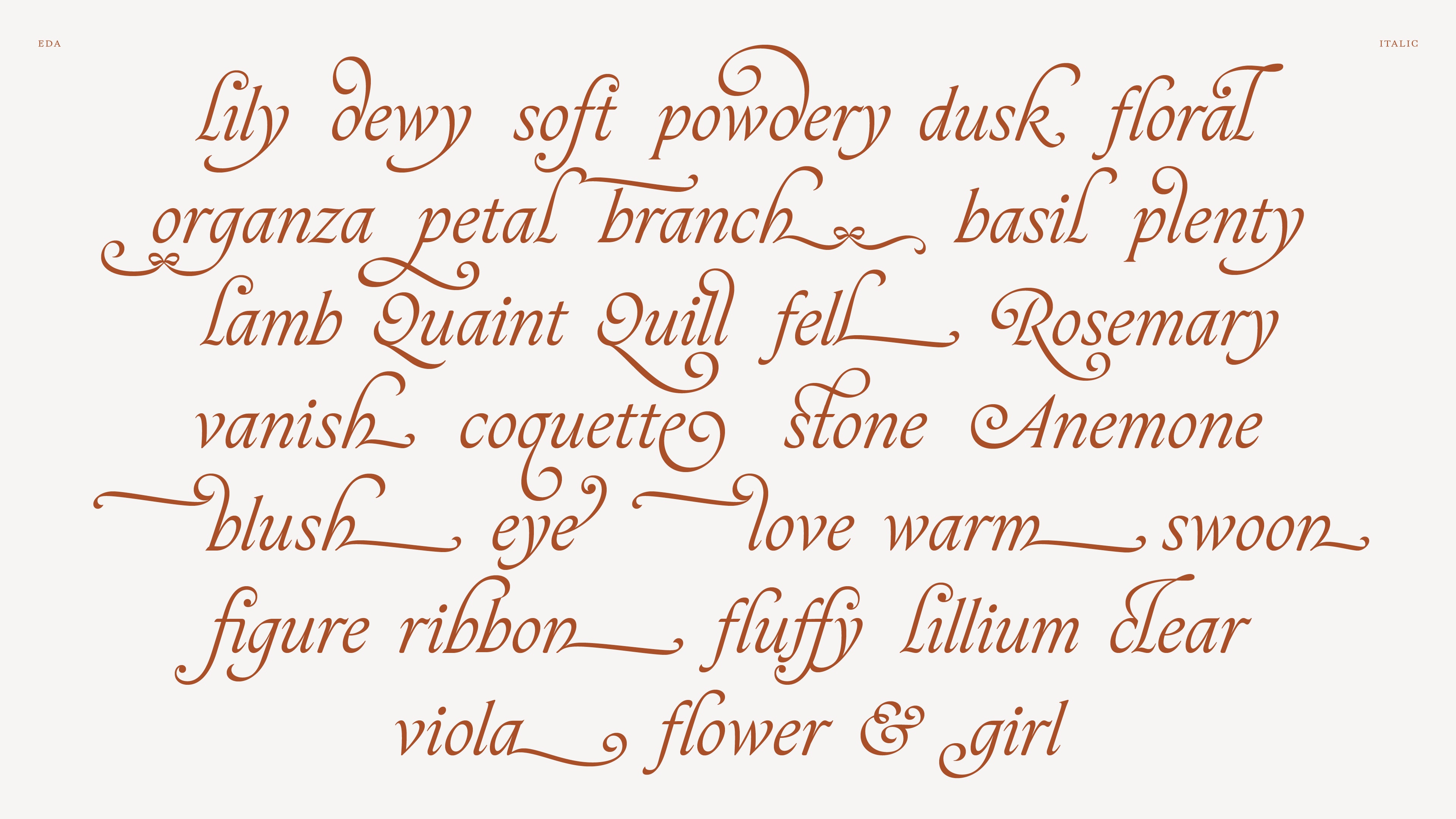
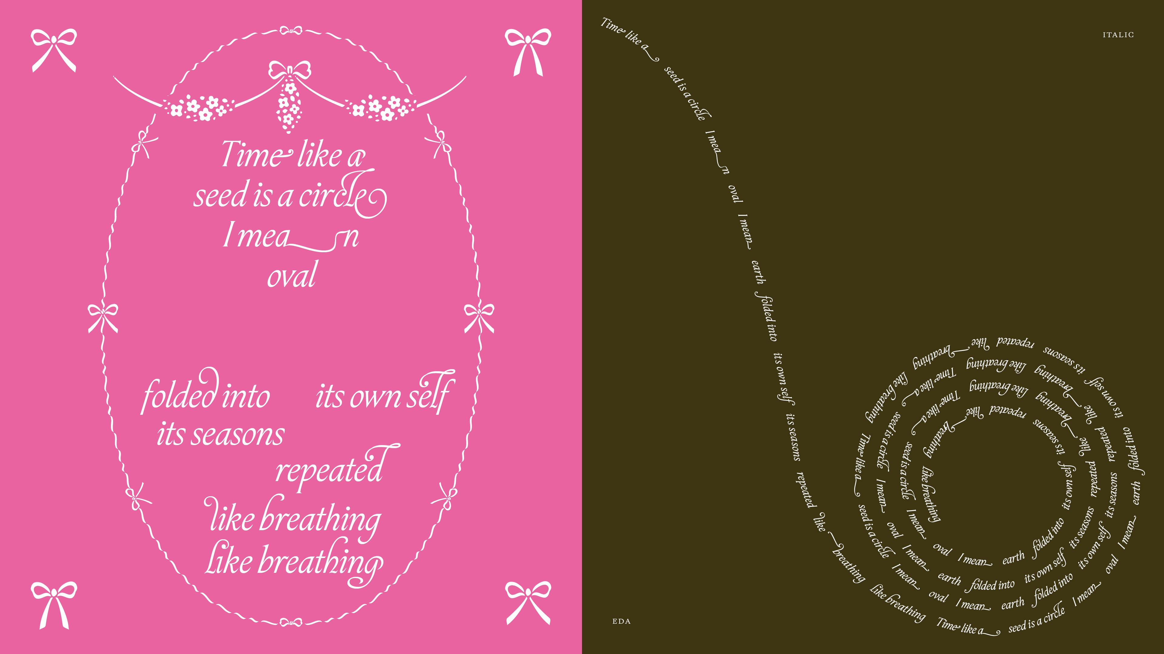
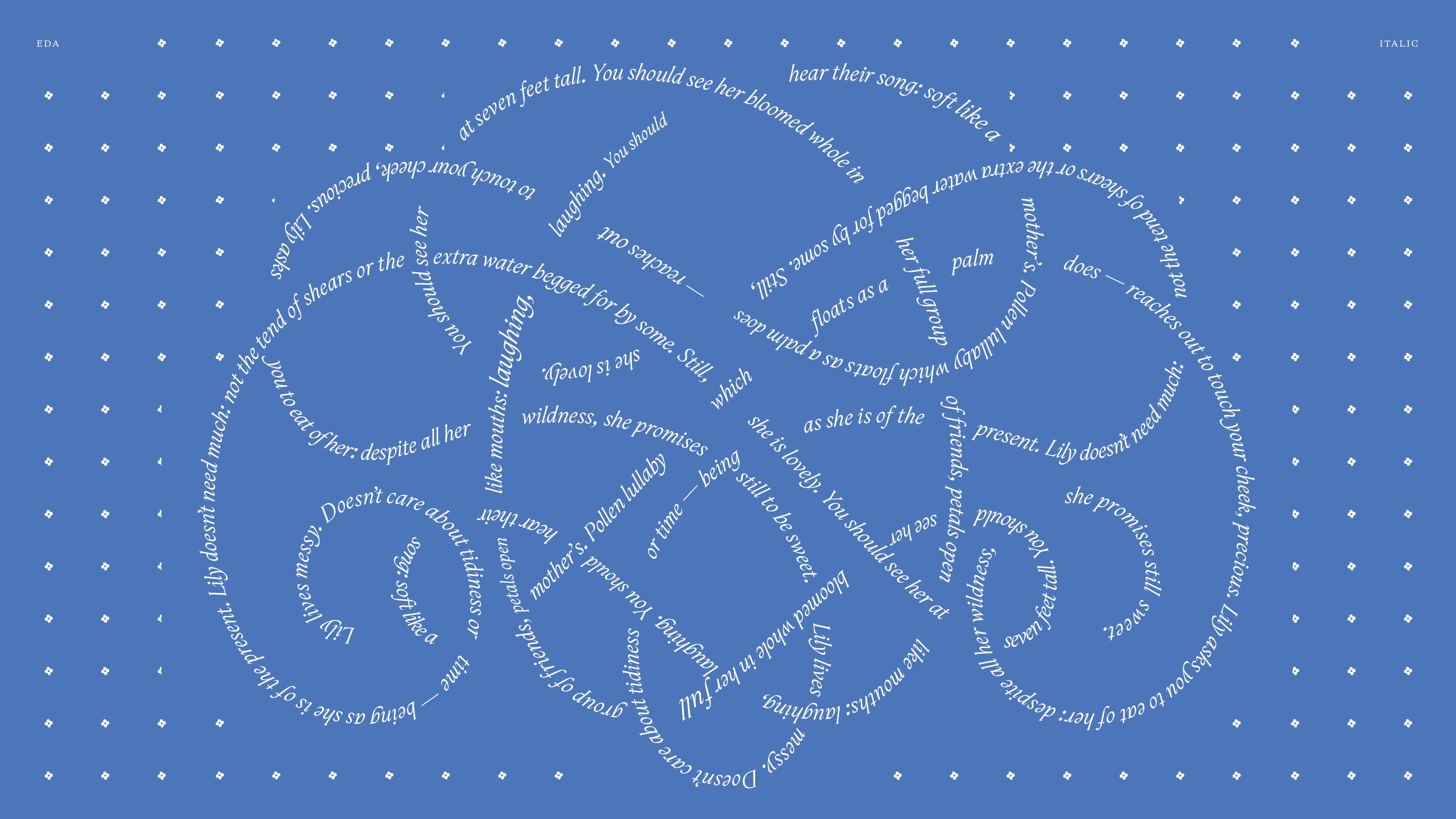
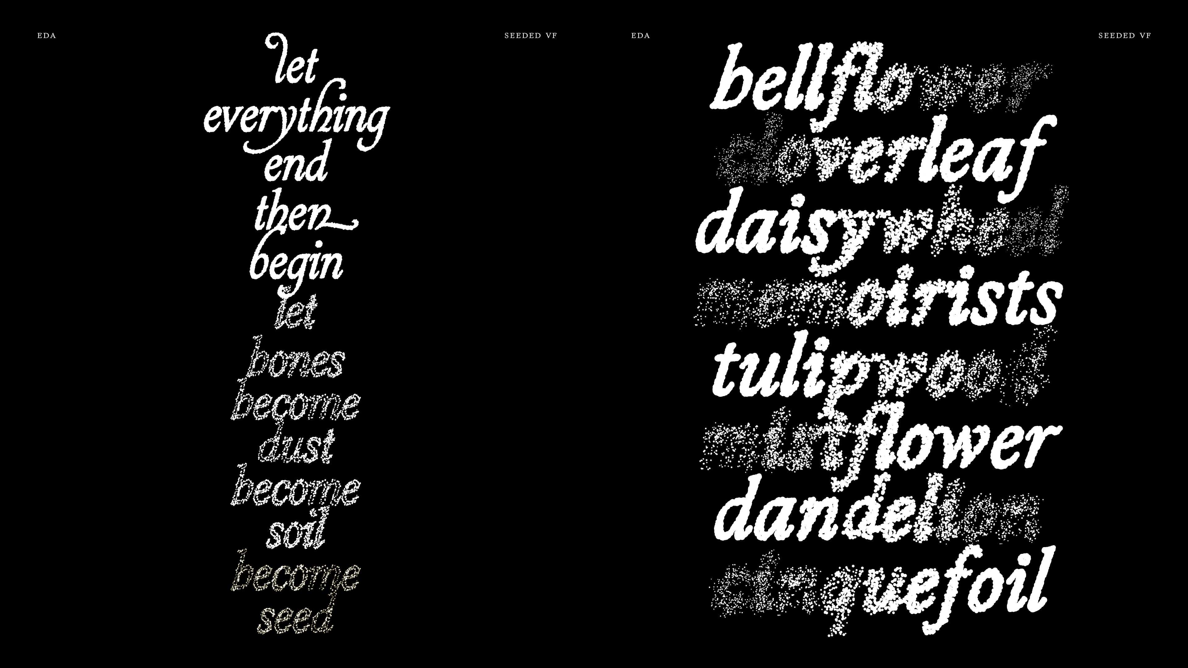
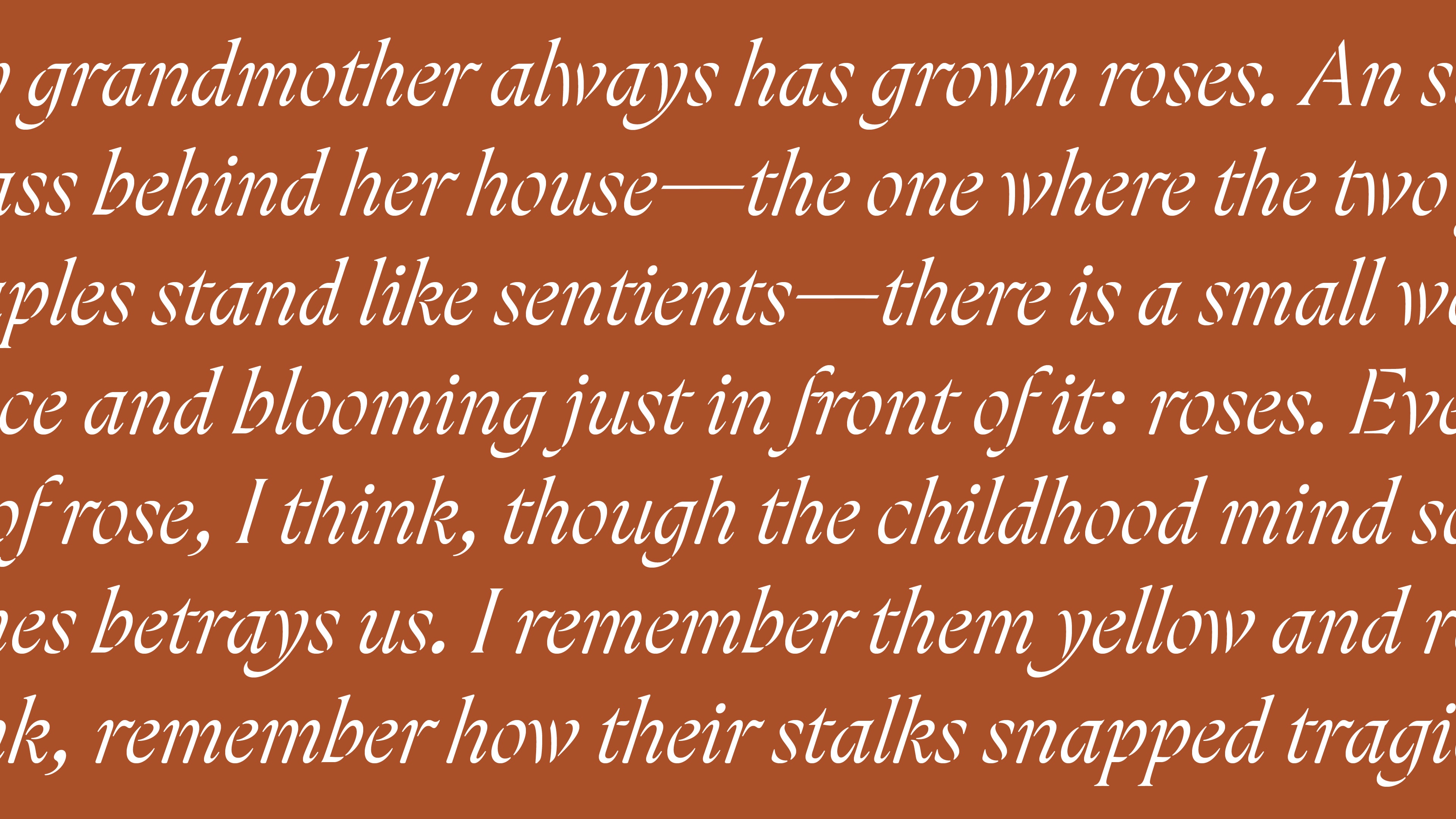
Eda (read as éda) by Ayaka B. Ito, is a multi-style Latin display family spanning nine styles — Light through Extra Bold, plus Italic, Ribbon Stencil, and Seeded — drawn from her brush writing and inspired by chancery penmanship, 1700s English gravestone carving, and Proef van Letteren by Johannes Enschedé.
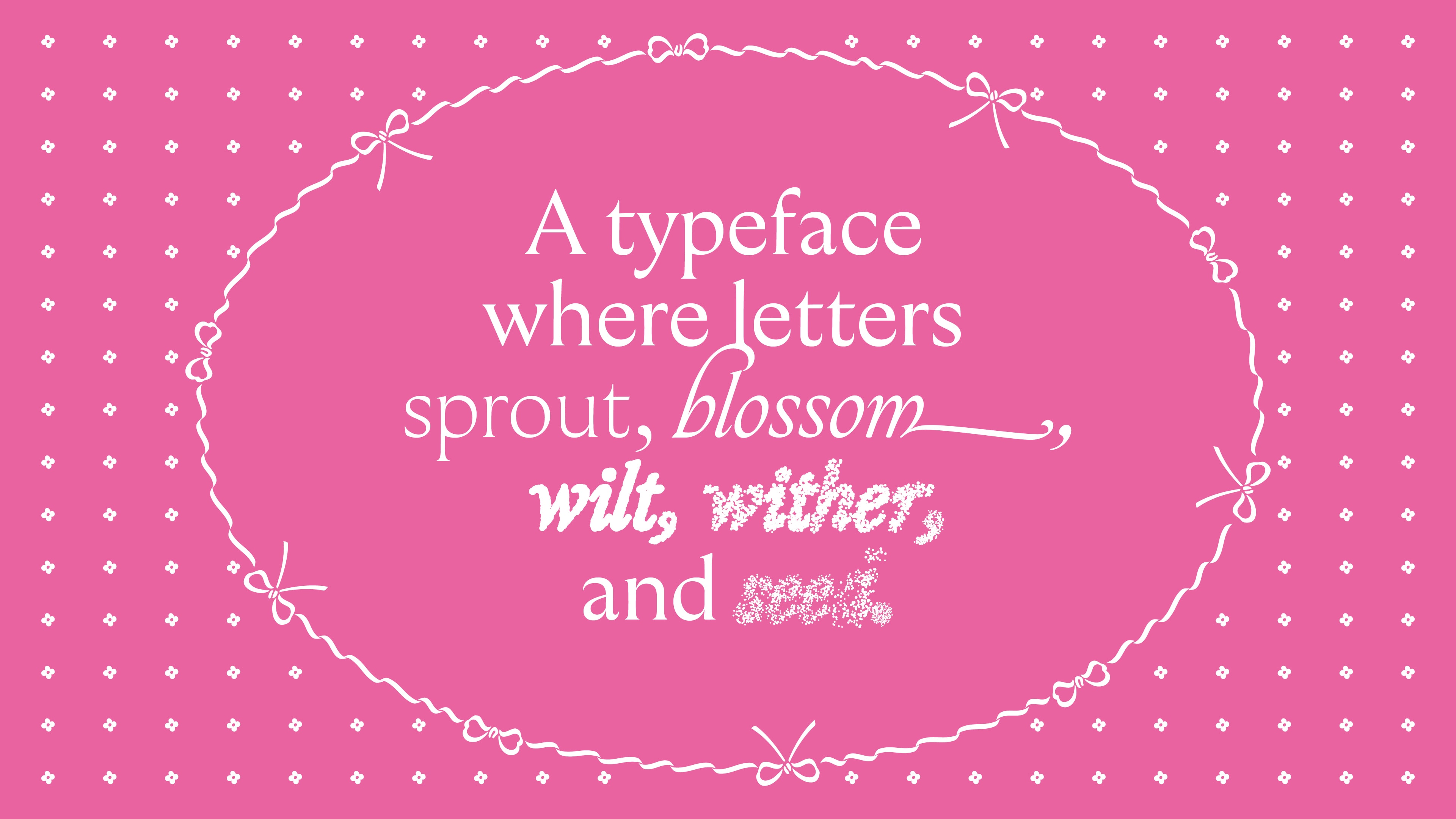
Named after the poet Zoe Branch, and after 枝 (eda), Japanese for branch, Eda is a typeface that sprouts, blossoms, wilts, and seeds.
A variable seed texture axis fills the letters with circles, from stippled texture to scattered seed texture, following the same arc. In the Italic, the blossoming is drawn out further as stylistic alternate swashes.
Ayaka B. Ito is a graphic and type designer based in NYC, and originally from Kawasaki, Japan. For over fifteen years she's been happily buried in brand identity, publication design, illustration, and custom type for fashion, food, and lifestyle clients. Her education wanders from Rochester Institute of Technology and School of Visual Arts, through the Type@Cooper Condensed and Extended programs, to a master's at TypeMedia (KABK). Her dream is to work in both Latin and Japanese scripts. Off the clock you'll find her lettering with Sharpies, petting nice paper and dogs, and adopting yet another craft hobby.